Nota is an AI-enabled SaaS company leveling the journalism playing field by making the publishing process accessible for all newsrooms. On the brink of their Beta launch, Nota reached out looking to solidify a strong foundation for their products.
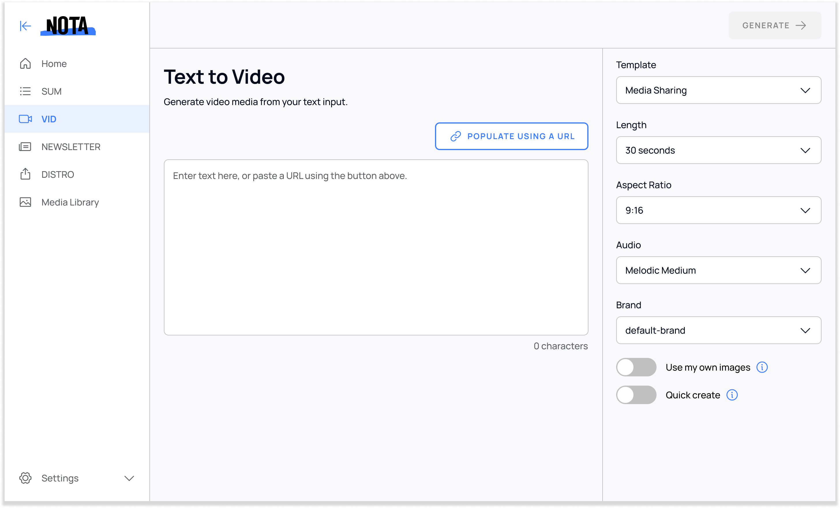
My task was to devise the blueprint for four of their new products. I created a design system, wireframes, and high-fidelity, dev-ready mockups in Figma.
As the first design hire it was my job to defend UX practices.
It was up to me to set personal constraints, timelines and limits.
How do you create a design system for a rapidly changing industry that's evolving at the speed of light: AI?
I created a scalable system from which to build consistent interfaces– leading to an intuitive experience for publishers.
I created building blocks for a system that Nota could use to build future tools.
Certain elements remain the same from tool to tool, fostering usability and streamlining workflows.
Simplicity and consistency are the bedrock of this reliable product.
Nota had two demo versions of their tools “SUM” and “VID”. What initially stood out to me was a lack of consistency from tool to tool regarding positioning of panels. There was no underlying system linking together the tools.
To align stakeholders, developers and other designers, I divided all of Nota’s products into reusable sections, or “Blocks”. This created a shared language everyone could use– making communication about products easier. This top-level framework also gave structure to the development of future products.
I used the Block framework to piece together user workflows.
In some cases, users could go directly from a tool's Home into the Editor section.
User starts on the Tool's homepage, fills out Setup Wizard, ends on Editor page.
There were some instances where users had to segue from one Editor to another, which is where the setup wizard came in handy.
After defining the big picture, I set out on creating the rudimentary components that make up each page. I pride myself on making design systems that are a balance of simplicity, intentionality, and flexibility.
I used the new design system to define a set of cross-product templated pages, lending even more consistency to the product ecosystem.
Homepages
Editors
Within each template, each tool has the same four main sections: Main Navigation, Action Nav, Main Content, and Output Settings.
SUM is a time-saving tool for editorial, marketing and content teams that generates headlines, summaries, top quotes, key points, SEO keywords and categories. I designed a card-based UI that makes it easy for users to interact with the generated content.
VID generates text and imagery, allowing users to create multi-purpose videos. I leveraged the positives and negatives of comparative and competitive tools to enhance the product’s user experience.
NEWSLETTER pulls from SUM's technology to generate emails from multiple content sources. As the third product I designed in the suite, I followed existing patterns set out by SUM and VID as users were already familiar with those blueprints.
Nota’s Suite of AI Tools has now grown to 7. All tools maintain the initial blueprint originally laid out.