Case Study Banner

Summary

Feed.fm is a media group that handles music licensing, curation, and music streaming API integrations for apps and connected devices. The existing station editing experience needed UX/UI optimizations and the product roadmap required the integration of new features.

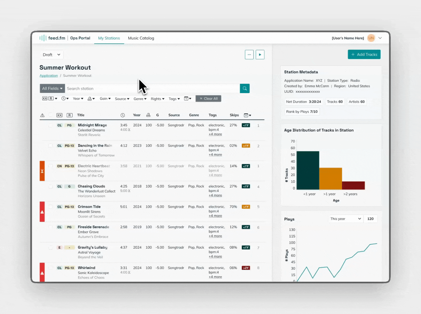
I worked with Feed’s Head of Product to design a new platform that allows curators to easily identify problem tracks, add new tracks, and edit station metadata–setting them up to reach their quarterly OKR goal of increasing editing efficiency by 25%.

Design System
Style Guide
Product Design
UX/UI Design

Details

Role

Lead Product Designer

Duration

June 2024 - October 2024

Website

feed.fm

Tools

Figma

Team

Case Team Image

Emma McCann

Product Designer
Case Team Image

Feed.fm

Developers
Case Team Image

Brita Nordin

Head of Product

Challenges

One challenge of this project was that space was of the essence. Tables included multiple columns of complex data, and curators had to manipulate that data in several ways in order to bring relevant information to the forefront.

Research Image

Granular UI

The Ops Portal has statuses, icons, alerts for various aspects of the product.

Research Image

Complex workflows

Curators need to manipulate data in several ways in order to bring relevant information to the forefront.

Research Image

Lots of metadata

The platform takes into account 1,000+ tracks per playlist.

Solution

The redesigned Ops Portal embodies dynamism and progressive disclosure to achieve streamlined workflows.

Dynamic

The new design champions responsive panels and progressive disclosure: showing users what they need to see depending on their journey.

Solution Image

Space-saving

The new design uses visual shortcuts to make room for new features and information.

Solution Image

Streamlined

By creating a dynamic, space-saving interface we were able to streamline curator's complex workflows.

Solution Image

Assessing the initial product

The initial product utilized the full width of the platform for track information. There was no spot on screen for detailed track metadata. What stood out to me was the lack of any vertical navigation.

A new paradigm

The existing ops portal relied heavily on modals for viewing track information and for the “add a track” flow. I flagged this as a potential issue with the team, as it’s easy to fall into the “modal on modal” trap. My philosophy is that modals should be reserved for quick user decisions, and shouldn’t encompass entire main workflows of a product.

Old paradigm

The initial platform relied heavily on modals. I called out how this could be a potential issue.  

New paradigm

I re-envisioned the platform so main flows could take place in the main interface, reserving modals for quick user decisions.

User testing the team

I proposed a round of user testing before proceeding further in the design process. Luckily, we had easy access to Feed’s in-house curators who would be using the platform firsthand.

Feature prioritization

After user testing three flows I cataloged both curator requests and issues. I worked with Brita to prioritize updates from 1 (Must Have) to 4 (Wish).

UI updates

Overall, curators were able to grasp the overall gist of each flow. But based on feedback we were able to execute some UI updates to the interface to correct for trip ups.

In our user tests, curators sometimes missed that they opened the track panel. To make it more obvious we added a new teal track header to draw attention to the change.

Curators also missed that some tracks were highlighted yellow to denote that they were station outliers. We changed the alert color to red to make the visual cue more distinct.

Introducing the dynamic panel

The existing station edit design was static. I introduced a dynamic panel that updates according to where the user clicks on the screen, providing contextual information. For example, when a user clicks on a track in the table, track information updates in the dynamic panel. Similarly, when a user clicks the “Add track” button, Feed’s catalog populates the dynamic panel, allowing users to select and add tracks to the station:

Thoughtful interaction design

In order to conserve screen real estate I harnessed the principle of progressive disclosure, only revealing track action buttons on hover.

A more efficient way to work

I designed an icon-based alert column in the track table that allows curators to sort through error, placeholder, and autoreplaced tracks.

Previously, curators didn’t have an efficient way to bring these types of tracks to the top of the pile to take inventory and make edits to them.

Alert

Placeholder

Autoreplace

Development hand-off

I took detailed notes in Figma going over hover states, templates, responsiveness breakpoints, and key user flows. I was on hand to answer developer questions as we imported components into Storybook.

Future steps

The redesigned Ops Portal launched in early April 2025 to much excitement from the Feed team. The goal is to increase station editing efficiency by 25%.